The List of Data Screen Types is one of our data perusal screens. This screen type is data-driven and enables you to visualise the rows in a data source.
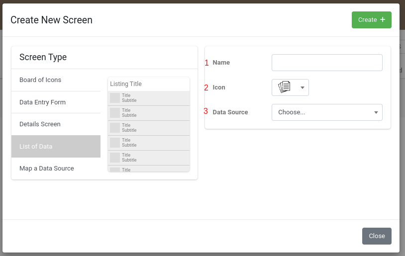
To add a listing screen, navigate to Apps -> Screens

Click on the +ADD NEW button on the right-hand side of the page


- Name your Listing Screen
- Select a suitable icon
- Select your data source
- Click on the +CREATE button

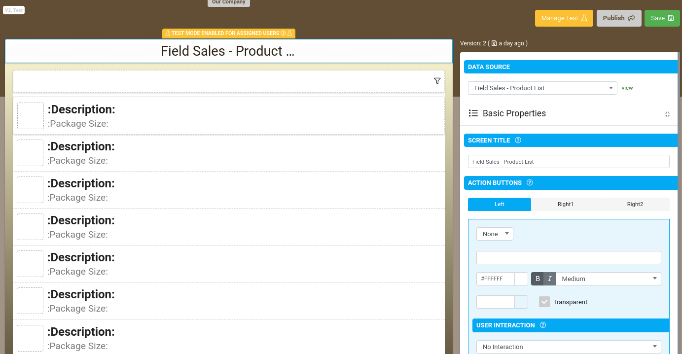
Configuring the Title bar
- Screen Title - This will be populated with the name of your screen.
- Action Buttons - Define buttons to appear on the title bar.
- Select which button you'd like to configure, LEFT, RIGHT1 or RIGHT2
- Select an icon
- Add the button text
- Select the button colors
- Select the user interaction.B
- Button Visibility - Control the visibility of this button using a formula
- Disable Conditional Styles - Whether or not conditional (i.e. column value specific) styles defined on the Data Source will override the styles defined in this design
Configure Filtering
Click on the Filter Bar on the top of the screen designer

Basic Properties
- Show Search Box - Whether or not to show a Search box
- Allow users to filter by column - Enables user to specify their own custom filters for the rows being displayed.
- User Filters override default - By default, any user filters are applied on top of the Default Filter. If this option is selected, the Default Filter is ignored when user filters are specified.
Validation & Behavior
- Search Pattern - By default, searching will filter rows based on the user's search text matching anywhere within the displayable row values.
This option allows you to specify a replacement regular expression for row matching.
Use {{this}} to refer to the user search text in your regular expression.
e.g. '^{{this}}' will show rows that start with the search text. - Default Filter - This allows you to specify the default filter formula for this screen. Any incoming filters will override any default filter specified.
e.g. {{this[0]}} = ORGMETA('projectId')
Layout & Styling
- Order by Column - Orders Data by a column from the Data Source. If left blank, then ordering is by the first displayable position - e.g. Title.
- Group By Column - Groups Data by a column from the Data Source.
- Background - The default background color of group headers
- Group By Conditional Style - Whether or not conditional (i.e. column value specific) styles should be applied to the background color or foreground text.
Conditional styles can be defined on the Rows page of the Data Source. - Sort Priority - Determines the priority/order in which to apply Grouping or Ordering
Configure a row
Click on a row in the screen designer
Configure the 4 items that are displayed on the screen, Title Left, Title Right, Subtitle Left Subtitle Right
by making a choice from the dropdown which corresponds to the column in the data source.
Thumbnail - Link the thumbnail of each row to a Data Source column
User Interaction - Define a user interaction for each row
Layout & Styling
Default Background - The default background color of all rows
Conditional Background - Determine the background color of each row according to the conditional styles on the given column.
Conditional styles can be defined in the Rows page of the Data Source


