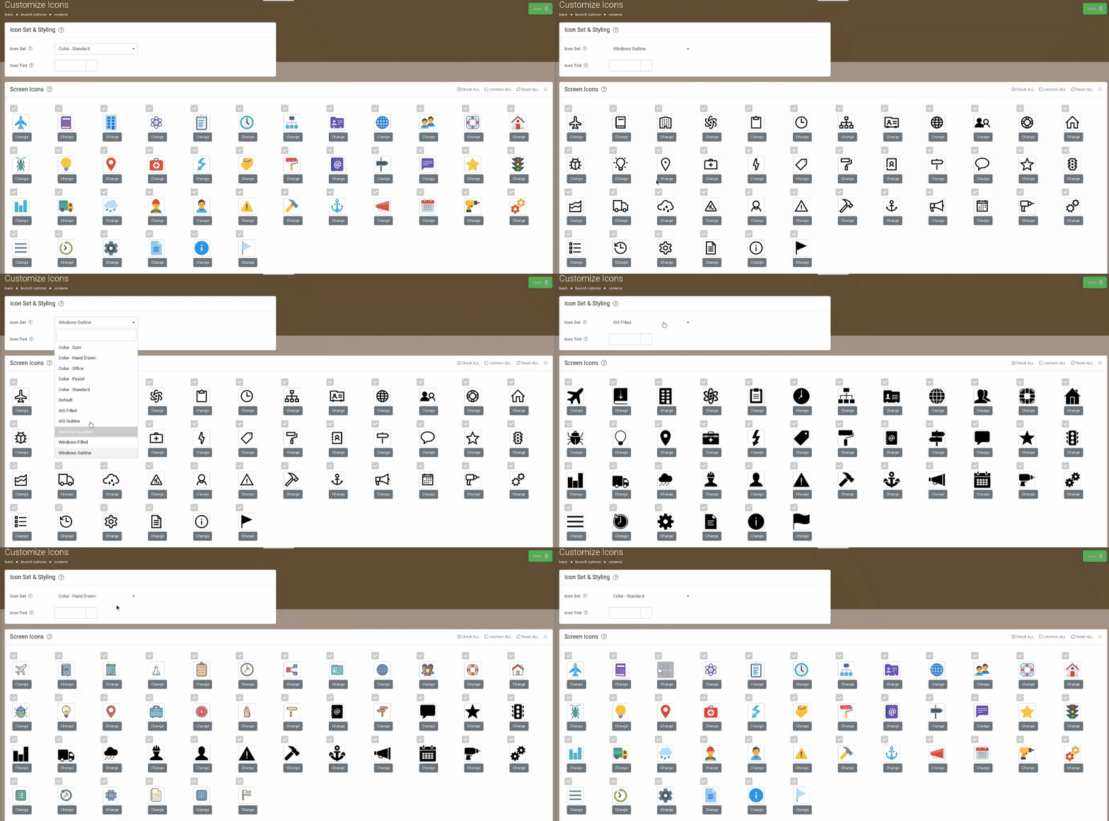
We provide icon customisation areas that allow you to choose from a few built-in icon sets as well as the ability to replace icons with your own custom images.

This can be done at two levels.
The App>App Setup>Customise Icons page provides the option to override this brand default at an organization level.
So for example, you could have environments with slightly different icons, where they override selected icons from the brand default as needed.
If you are using App as a Service (i.e. you have your own branded apps), then you can use the Branding Center>App Settings to define a "brand level" icon set.
This becomes your default icon set for any organization account that is set up under your brand in our system.
So if you use our Enterprise Toolkit, then all environment accounts will default to using the icons as defined in the Branding Center.
Similarly, if you are a Vendor, then all client accounts will be created using your Branding Center defaults.
There is no additional charge for changing icons in the Branding Center or in App Setup.
After saving any changes, icons will automatically download to the device when it next synchronizes.
All custom icons or replacement images MUST be 192 x 192 pixels in dimension and must be PNG file type.
Icon Sets & Styling
Customise the icons seen on the app and available for use when building Screens in the platform.
Choose an icon set and then exclude or replace default icons with your own images as desired.

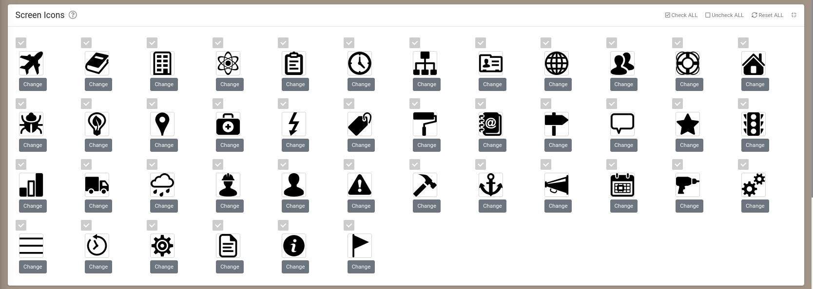
Screen Icons
These icons are available for use in Screens and Docs that you create in the platform.
Icons that you do not wish to make available for use can be disabled by unticking the box next to the relevant icon.
To replace an icon with your own custom image, simply click on the image and choose the desired image file.

Annotation Icons
These icons are used in the app for annotating captured photos and other images/drawings.
If you have industry or company images, stickers or logos that you wish to make available as annotations, simply replace an existing icon by clicking on it below.

System Icons
These icons are used internally within the app for built-in functionality such as Form navigation.
You can replace System icons with your own custom images by simply clicking on the image and choosing the desired image file to upload.
You should provide replacement images that have similar meanings to the originals to avoid user confusion in the app.

Creating Icon Boards for Custom Navigation
We’ve also added support for displaying small circular “badges” next to icons on the app start screen as well as on Icon Board screen types that indicate a saved and uncompleted form.
These badges would generally be used to display a number as one would typically see in iOS apps.
The Icon Board screen can also be customised as follows:
- Icons can be coloured
- Icons can be hidden via a Visibility formula
- Icons can display badges (which have their own Visibility and other customisation options)
- The “Automatically Generate Icons” option allows you to specify that the app should generate the icons based on what the user has access to. This makes it easy to provide your own custom start screen with dynamic icons.

