
In our system, the Choices field is kind of like a Swiss Army Knife - it is a multi-purpose field that enables displaying sets of choices in a variety of different ways.
As such, Choices fields have a few configurable properties, which can be a little overwhelming if you try to understand them all at once!
While we provide information on field properties in the Form designer itself via hints (?), below are some basic and key aspects of the Choices field.
CONTENTS
- Display Styles
- Answer Choices - Static List
- Answer Choices - Data Source List
- Display/Value Columns
- Filtering Rows
- Allow Form Fields To Modify Data Source
- Unique Properties
- Multiple Choice
- Collapse Options On Select
- Auto-Complete Threshold
- Auto-Select Single Choice
- Allow Barcode Lookup
Display Styles
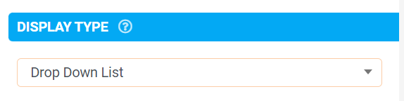
Depending on your display requirements, the Choices field's display type property controls how options added to the field are displayed in-app. The following display types are available.
Drop Down List A compact single-line entry that opens a listing of choices for selection. List of Choices Vertical layout shows each option available with a checkbox.
Also allows the display of additional row information if you use a Data Source for your answer choices.
Horizontal layout, each option shows as a button labelled with the option text.
Also allows for up to 5 custom button colors (1st 5 options) to be set, any additional options will display the platform's default color. Auto-Complete Search Shows a search box that then shows filtered results as the user types. |
 |
Note, the app will automatically show an Auto-Complete search box for any display style with an option count that exceeds the Auto-Complete threshold value.

This threshold can be set under the Choices field's Layout&Styling > Auto-Complete Threshold property.
Answer Choices - Static List

The Answer Choices property controls the list of choices shown to the user in-app.
A Static List allows for options to be manually entered. Each option requires a Displayed Value and Answer Value.
The Displayed Value is what will be visible in-app, and the Answer Value will be the field's actual value when an option is selected.

These values (Displayed/Answer) can be the same but having a Displayed and Answer Value available allows for lengthy Displayed Values, and Answer Values simply being a code or abbreviation of the Displayed Value.

Note, duplicate Displayed Values are possible but Answer Values MUST be unique.
Alternatively, you can autoload the Choices field's options from a Data Source. This more powerful approach lets you reuse your options list across fields/Forms.
You can also filter the options shown and even bind other fields to Data Source columns.
Answer Choices - Data Source List

Aside from choosing a Data Source to drive your Choices field list and specifying a Display Column and Value Column. You can also filter data source rows (i.e. options) shown based on user input in-app and populate column values into other fields.
Display/Value Columns
By default, but editable, the 1st and 2nd columns of your chosen Data Source will be used as Value Column and Display Column, respectively.
Use these options to use other columns for your answer and display value instead.

Note that if you do so, the app will automatically use only the unique set of possible values found in the given column - i.e. there will be no duplicate options shown to the user.
Filtering Rows
Dynamically control what rows are displayed in your Choices field using fixed criteria or a formula.

Detailed information on how to use this option can be found by clicking the hint (?) icons and Creating a Formula.
Note, dynamic filters that change the amount of choices dynamically will refresh the Choices field's displayed list of options.
Allow Form Fields To Modify Data Source
This option enables creating/editing the row selected in your Choices field.

You do so via the "Bind to Data Source Column" property found on most fields - this property will show if the "Create/Update Row" checkbox is selected on your Choices field.
More information on Creating, Updating and Deleting Rows in a Data Source might be of interest.
Unique Properties
Multiple Choice
If enabled, allows multiple choices to be selected from the Choices field list.
Usually, the Choices field will have a single value based on the option selected. However, with multiple choices enabled, each option selected will be joined and separated by a '|', which creates a list of values (i.e. Option1|Option2|Option3...).
More information on how to use a list of values can be found in our Formula Cheat Sheet under Lists/Set of Values and Choices functions.

Collapse Options On Select
If enabled, the app will automatically hide all other options once the user makes a selection.
If the user unselects their chosen item, the hidden options will reappear.
This does not apply if the field is using Drop Down display style.

Auto-Complete Threshold
The app will automatically show an autocomplete search box when the option count exceeds this value, regardless of the Display Style.
This is to ensure good performance with very large lists of options - e.g. product catalogs.

Auto-Select Single Choice
By default, if your Choices field only has one available option, then that item will be automatically selected as the answer. This can speed up user data capture when filtering or using the Barcode Lookup to narrow down the options available in the field.
Uncheck this property if you would instead force the user to manually select when provided with a single option in the Choices field.

Allow Barcode Lookup
Users can scan a barcode, and the app will automatically look up the result in the available choices. This feature is particularly useful when a Choices field is driven from a data source containing a barcode column that the scanned barcode is checked against.

